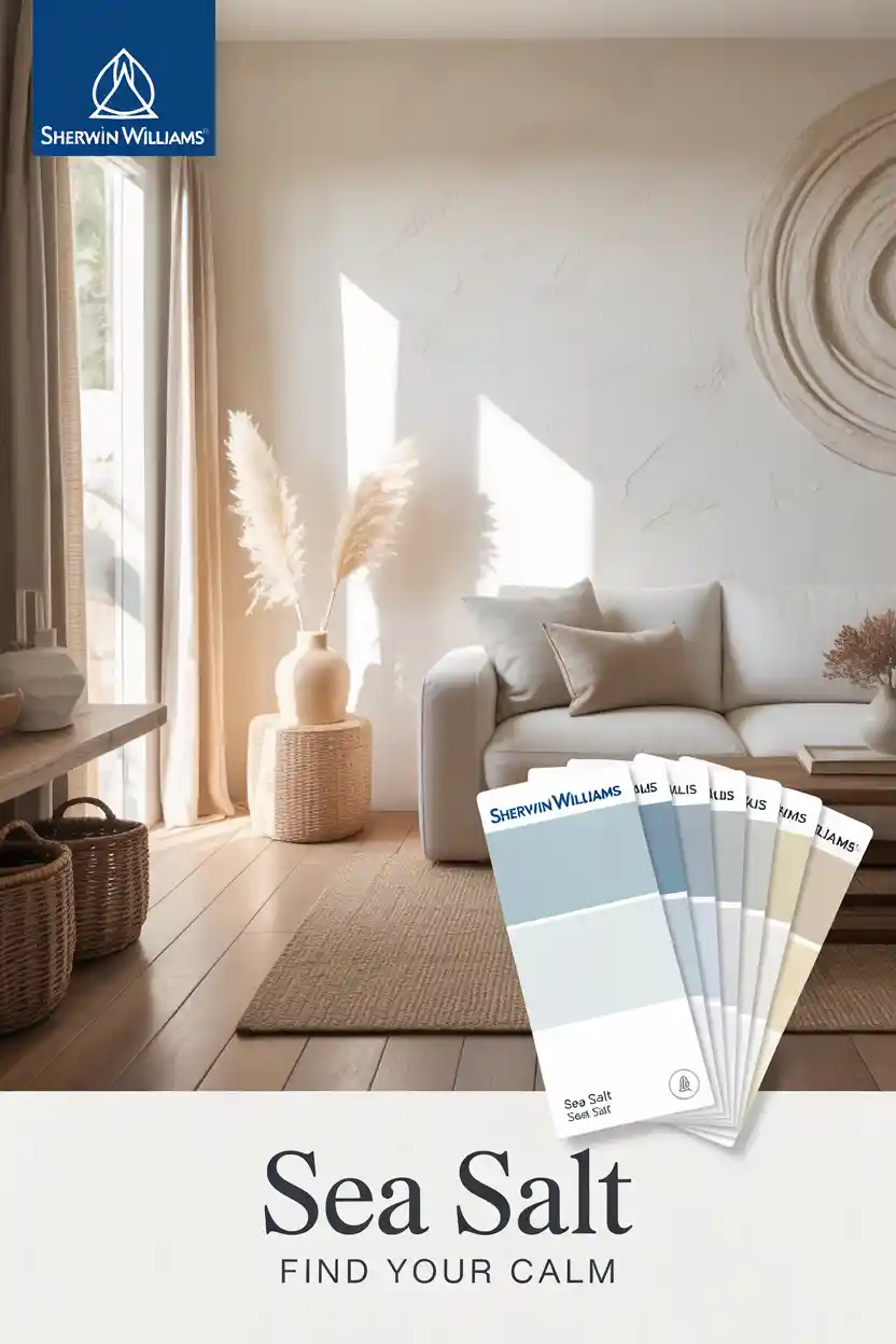
9 Sherwin Williams Sea Salt Palette Ideas
When it comes to timeless, soothing paint colors, Sherwin-Williams Sea Salt is a favorite among designers and homeowners alike. With its perfect balance of soft green, subtle blue, and gray undertones, this shade creates a calm, inviting atmosphere in any space. But the real magic happens when you build a Sherwin-Williams Sea Salt palette—pairing this coastal-inspired hue with complementary colors to achieve a cohesive design throughout your home.
In this post, we’ll explore nine inspiring Sherwin Williams Sea Salt palette ideas that work beautifully across bedrooms, bathrooms, kitchens, and even exteriors. Whether you’re drawn to farmhouse charm, coastal serenity, or a whole-house flow, there’s a Sea Salt palette idea here for you.
1. Sherwin Williams Sea Salt Color Palette for the Bathroom
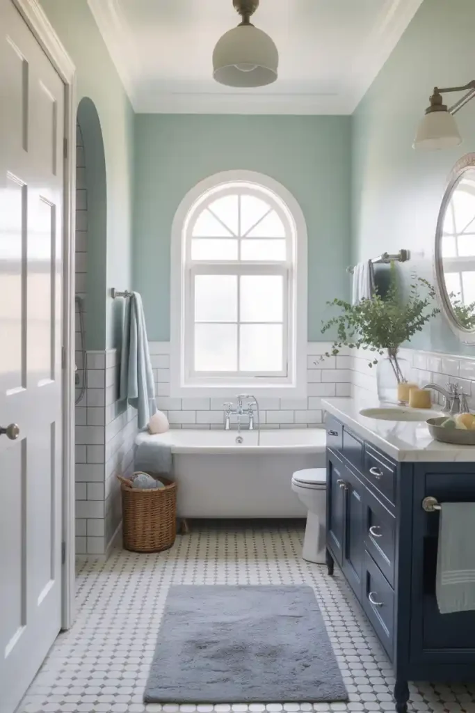
Bathrooms are the perfect place to embrace serene tones, making the Sherwin Williams Sea Salt color palette bathroom combination a natural fit. Pair Sea Salt on the walls with crisp whites like Pure White for trim, cabinetry, and ceilings. For added dimension, consider accents of silver fixtures, pale gray tiles, or even a soft navy vanity.
This combination creates a spa-like retreat that feels fresh, clean, and calming. If you’re looking for more ideas, check out these modern small bathroom inspirations for clever design solutions.
2. Sherwin Williams Whole House Palette with Sea Salt
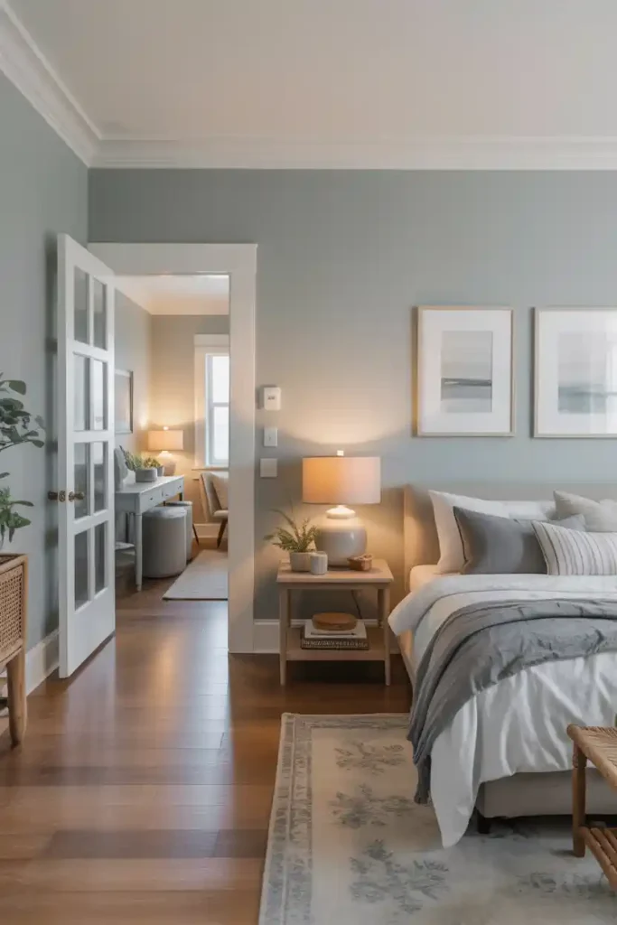
If you want color flow throughout your home, a Sherwin Williams whole house palette with Sea Salt is a versatile choice. Sea Salt works beautifully in main living spaces, hallways, and bedrooms, seamlessly connecting each room. Complementary neutrals like Agreeable Gray or Alabaster keep the palette soft and welcoming.
To avoid monotony, bring in accent walls or furniture pieces in deeper shades like Comfort Gray or Retreat. This layered approach ensures your home feels cohesive yet dynamic. For additional tips on creating harmony across rooms, see our bedroom color scheme ideas.
3. Coastal Color Palettes with Sea Salt Sherwin Williams
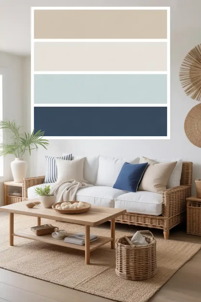
Few shades evoke the beachy, breezy feel of the coast as well as Sea Salt. Coastal color palettes with Sea Salt Sherwin Williams work perfectly in living rooms, sunrooms, and kitchens. Pair Sea Salt with sandy beige tones, soft whites, and navy accents for a true seaside look.
Incorporating natural textures like rattan, driftwood, and linen fabrics enhances the coastal theme. Even simple touches like a striped rug or woven basket can tie the look together. If you’re a fan of coastal design, don’t miss our coastal iPad wallpapers for digital inspiration, too.
4. Sherwin Williams Sea Salt Paint Palette for Bedrooms
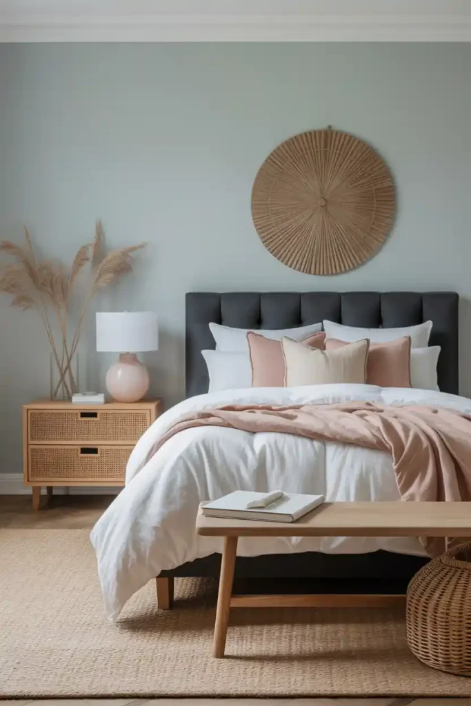
Bedrooms deserve a calming backdrop, and a Sherwin Williams Sea Salt paint palette creates exactly that. Sea Salt’s muted tones pair beautifully with soft blush accents, warm wood furniture, and neutral linens.
If you prefer a bold contrast, consider pairing Sea Salt walls with a charcoal upholstered headboard or black accents. This balance of soft and strong gives the bedroom depth and sophistication. For more inspiration, see these room inspiration bedroom ideas to help create your perfect retreat.
5. Farmhouse Color Palette Sherwin Williams Sea Salt
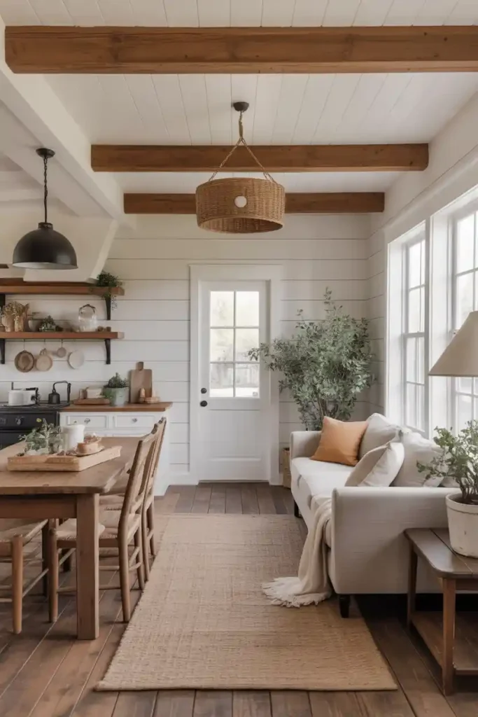
For those who love rustic-meets-modern design, a farmhouse color palette with Sherwin Williams Sea Salt is a great choice. Sea Salt pairs beautifully with warm wood beams, shiplap walls, and matte black hardware. White trim adds brightness, while muted accent colors like Accessible Beige or Dover White create balance.
This palette is cozy yet refined, and it adapts well to both modern farmhouse and traditional country styles. For exterior farmhouse inspiration, check out our modern farmhouse exterior ideas.
6. Coastal Color Palette Sherwin Williams Sea Salt for Kitchens
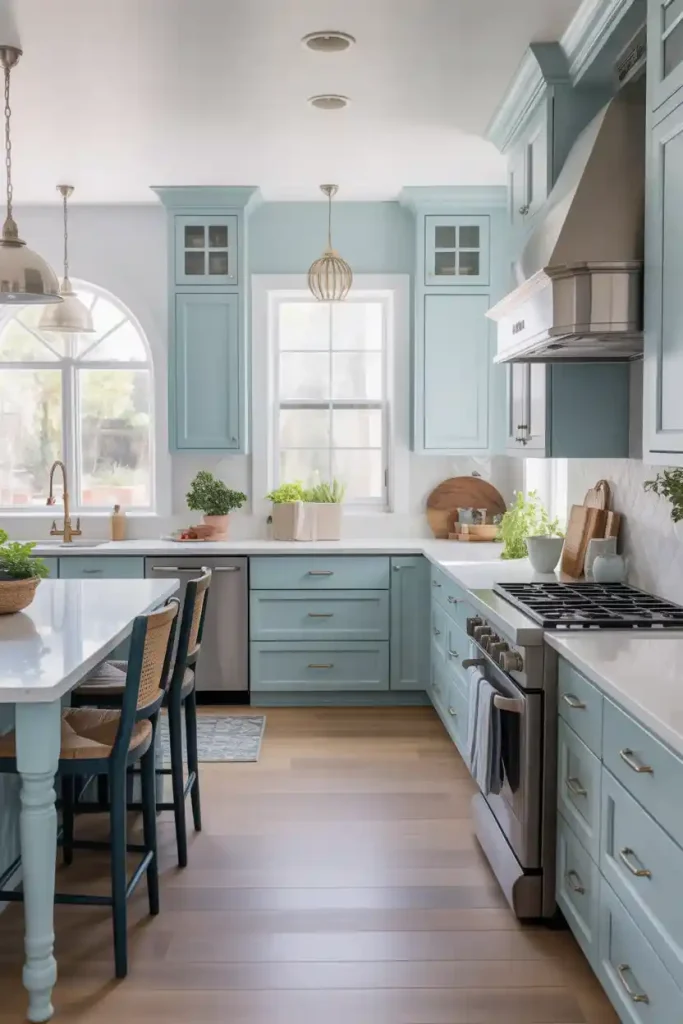
A kitchen painted in a coastal color palette Sherwin Williams Sea Salt feels light, airy, and welcoming. Imagine Sea Salt cabinetry paired with white quartz countertops, brushed nickel hardware, and light wood flooring. Add in navy or aqua accents through bar stools or backsplash tiles to bring a touch of the ocean indoors.
This color combination not only enhances natural light but also creates a kitchen that feels timeless and fresh. For more tips, you might enjoy our guide on how to decorate kitchen counters with style and functionality.
7. Sherwin Williams Sea Salt Palette Exterior

Yes, Sea Salt isn’t just for interiors—it’s stunning on exteriors, too. A Sherwin Williams Sea Salt palette exterior pairs this subtle green-blue with crisp white trim, warm gray shutters, or even navy front doors. The result is a soft, coastal-inspired curb appeal that feels both modern and timeless.
For homeowners who want to stand out in a subtle way, this palette offers uniqueness without overwhelming the neighborhood. For further exterior tips, explore our house exterior ideas that elevate curb appeal instantly.
8. Sherwin Williams Sea Salt Whole House Palette with Accents
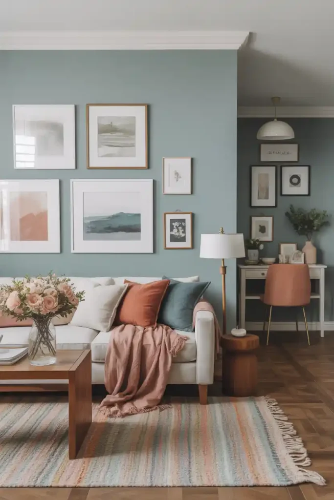
Another approach to a Sherwin Williams Sea Salt whole house palette is adding colorful accents. While Sea Salt creates the base, you can layer in muted blush tones, dusty blues, or even warm terracotta for variety.
For instance, try Sea Salt in living areas, a soft blush in the dining room, and a deeper gray-green in the office. This subtle shift in tones makes your home feel curated while keeping the palette consistent. To tie it all together, learn how to arrange pictures on walls for cohesive styling.
9. Sherwin Williams Sea Salt Color Palette for Kitchens and Bedrooms
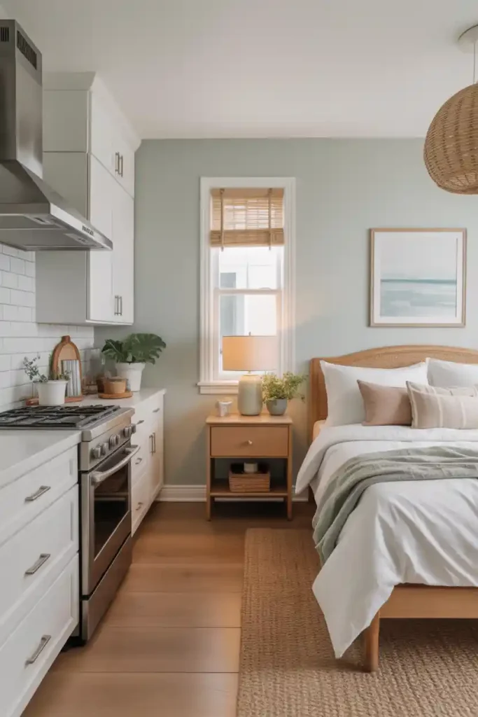
One of the most versatile applications is using the Sherwin Williams Sea Salt color palette kitchen and bedroom together. Imagine a Sea Salt kitchen paired with white cabinetry and brushed nickel accents, while the bedroom carries the color onto the walls with soft beige and wood accents.
This creates harmony across different parts of the home while giving each room its own personality. For small bedroom inspiration, see our small double bedroom ideas that maximize both space and style.
Final Thoughts
The Sherwin-Williams Sea Salt palette is more than just a color—it’s a design foundation that adapts beautifully to multiple styles and spaces. From farmhouse kitchens to coastal living rooms and spa-inspired bathrooms, Sea Salt creates a sense of tranquility and flow.
Whether you use it throughout your entire home or as a feature in key spaces, this versatile shade proves why it’s one of Sherwin-Williams’ most beloved colors. Paired thoughtfully with complementary hues, textures, and finishes, Sea Salt can transform your interiors—and even your exterior—into a cohesive, welcoming haven.